
Pare 2.0.0
Pare design system
Pare is one system for the whole site: every page shares the same type, spacing and components. It is open source, so you can install it too.
Get started
One foundation, one set of components
Everything rests on one foundation, and the components are built on it. The package holds both; this site uses them as they are.
Layer 1
Pare Foundation
Tokens in three tiers, colour, type, space, radius, motion, icons and the accessibility rules. foundation.css.
Layer 2
Pare Web
16 shared components that read only foundation tokens. components.css and the Astro files.
- Package@eunsungux/pare 2.0.0 ships both. Install it under Installation
- This siteLoads its own stylesheet, which holds the same rules; a change to Pare is made in both, in the same pull request. Only 2 components, the side nav and the footer, stay in the site; small wrappers pass its links and projects to Header, Card and Carousel
- New componentGive it its own component tokens that read existing semantic roles, such as --card-bg: var(--card). No new primitive or role unless no role covers the need
- New themeSee Theming
Principles
Six principles guide every decision. The first five come from the Portfolio website case study .
- FocusedThe design is simple, so visitors look at the projects and not at the interface
- ConsistentAll pages use the same layout and the same components, so the site is easy to learn
- Few stylesA small number of sizes, spacings and colours, repeated on every page
- Easy to navigateVisitors can always see where they are, and move to another section or project in one step
- Every deviceThe same content and features on a phone and on a computer, and usable with a keyboard
- SimpleOne name for each value. A new token never repeats a value an existing role covers, and values that are almost the same are merged, so the system can grow without getting complicated
Foundations
Rules every component meets
Four foundations: who Pare must work for, how its text is written, how a page is laid out, and how a theme changes. Accessibility comes first.
Accessibility
Every component meets these standards before it ships.
- ContrastText 4.5:1, a control’s edge or a state indicator 3:1. White on black 21:1; #BDBDBD 11.2:1 on black; #595959, the one grey on white, 7.0:1; the accent #E32902 4.58:1 as text on black, as text on white and under a white label; --input 3.01:1 on black
- TargetsEvery control has a 44 × 44px target. Buttons are drawn 40px and a transparent ::before makes up the rest; checkboxes take the rest from their label. Links inside a sentence are exempt
- FocusA 2px white outline at a 3px offset on :focus-visible, black on white panels. Inputs turn their underline to the accent instead. Closed panels are visibility: hidden, so they leave the tab order
- Reduced motionEvery transition and animation is turned off under prefers-reduced-motion
- StateEvery state changes more than colour: a fill, an edge, a bar or a dot. Native elements, aria-labels on icon-only controls, and aria-current on the current item
- Alt textSay plainly what the picture shows. Leave alt empty for a picture that only repeats what is next to it
Do
- “A remote technician watching a sixteen-patient video grid on a wide monitor”.
Don’t
- “Screenshot”, “image of…” or the file name.
- Claims the page doesn’t make.
Writing
All text is plain, literal and consistent, so every page is easy to understand.
Voice
- Plain wordsShort, common words. If a simpler word means the same, use it
- LiteralSay exactly what happens. No metaphors or idioms
- High-level firstWhat was done and why; leave out details the reader doesn’t need
- HeadingsShort, and name the purpose or the main finding. Not a command or a long description
- Accurate claimsOnly what the site does or what was measured. Numbers and user quotes stay unchanged
- SentencesDon’t start several in a row with “I”. Say the main point once. An intro is one or two sentences
Naming
- One term per thingThe same word in the nav, the headings and the body: “Featured work” (never “Recent work”), “case study”, “design system”, “project card”, “contact panel”; Pare, Pare Foundation, Pare Web
- Meta line“Type of work · Company, Year”, set once in PROJECT_META in main.js
- ChipsStatus first (Shipped or Live), then the timeline with MM.YYYY dates, role, team and platforms
- TokensNamed by role, not value: --primary, --input. A surface has a -foreground token; white-panel versions end in -inverse
Grammar and mechanics
- PunctuationCurly quotes and apostrophes; an en dash for ranges (1–3k); an em dash in “Option A — …”; a middle dot as a separator; no full stop on headings
- NumbersMM.YYYY dates in chips; no plus sign on a reduction; tabular numbers in data
- SpellingBritish on every page except the resume, which stays American. Code and UI names stay as they are
Do
- Start a button with a verb that says what happens: “Send a message”, “View resume”.
- Say where a link goes in its words; → for this site, ↗ for another site or a new window.
- Name the action and the thing in an aria-label: “Next projects”.
Don’t
- “Submit”, “Click here”, “Learn more”.
- “Here” or a bare URL as link text.
- A full stop or exclamation mark on a label.
Layout
One 12-column frame and one case study template, so every page lines up on the same edges. Spacing values are in the space tokens.
12 columns, 24px gap
How a case study sits on it
How a page without side navigation sits on it
- Frame1240px wide, a 32px gutter (24px on phones), 12 columns with a 24px gap
- Case studySide nav on columns 1–3, content on 4–12; below 1000px the nav becomes a row above full-width content. This page uses the same split
- RhythmHeading to intro 16px, intro to content 48px, 64px above a subhead and 8px below it; a section closes with 48–96px
- Breakpoints1024px two-up, 1000px case study grid, 900px overview and stats, 860px menu, 760px one column, 620px gutter, 600px carousel
Case study template
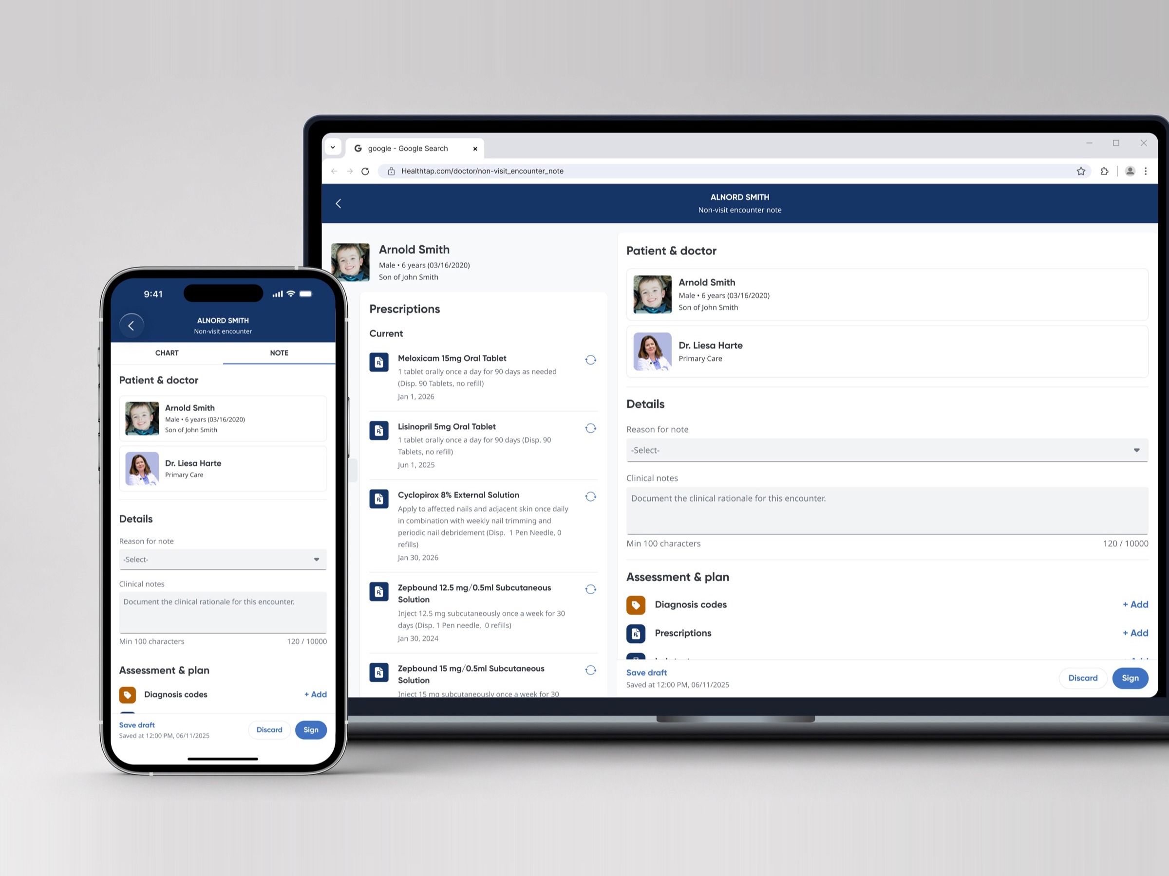
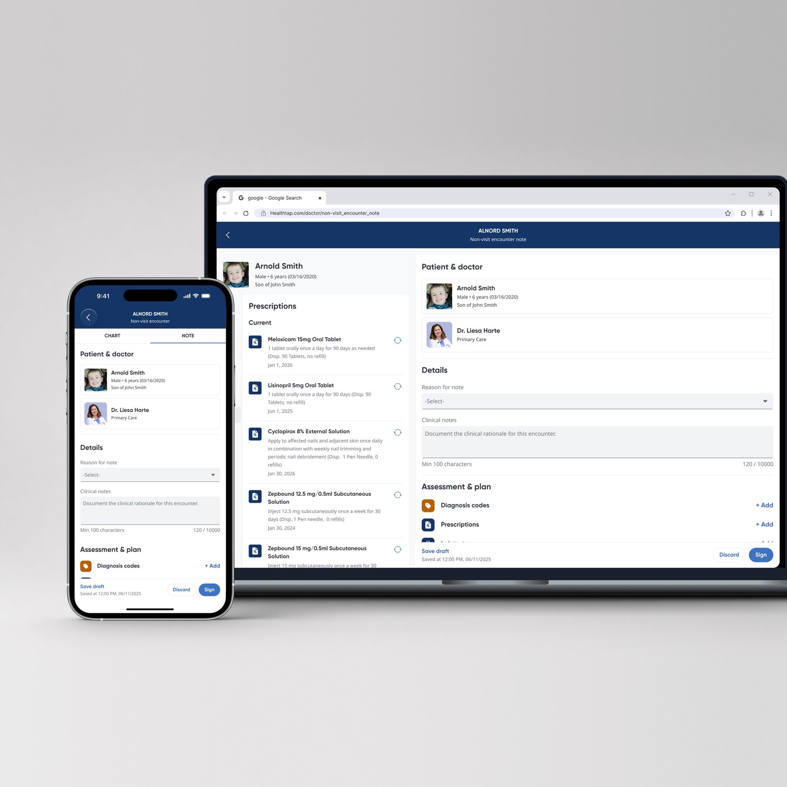
- OrderHero, cover, side nav beside the overview and numbered sections, then the carousel
- SectionsOverview, Problem, User research, Design exploration, Final or MVP design, Usability testing, Design iteration, Impact
- Section labelA two-digit number from a CSS counter, the label, and a 48px line. The h2 below states the finding
- PicturesOne per project, recomposed rather than cropped: a 4:3 cover (2400px wide) and a 1:1 card picture (1600px)
- RevealCovers, overviews, figures, cards, stats and quotes rise in once as they reach the screen
Theming
A theme overrides semantic tokens on one selector; components and primitives stay as they are. Pare ships one: .pare-inverse, for white panels.
- Live
- Design system
- UseAdd .pare-inverse to a white container: About, the mobile menu and the contact panel
- Secondary buttonWhite fill, black label, 42% black edge; a 6% black fill on hover
- Primary buttonKeeps its fill; only the focus outline turns black
- Chips and fields#595959 labels and 42% black edges; the accent stays for focus and checked
- New themeCopy the pattern: one selector that sets the semantic and component tokens it changes
Styles
Two grounds, one accent, one type family
How Pare looks. Every style is a token, so a value is set once and used everywhere.
Colour
Black and white grounds, few greys, and one accent kept for state: selected items, section numbers, the primary button, focus underlines and checked controls.
Background#000000 · --backgroundDark panels; black type on the About panel — 21:1
Foreground#FFFFFF · --foregroundText on dark panels, and the background of the About panel — 21:1
Muted foreground#BDBDBD · --muted-foregroundSecondary text on the dark panels, the grey hero word — 11.2:1 on black
Muted foreground, inverse#595959 · --muted-foreground-inverseThe only grey used on white panels: the About skills text, the mobile menu links, and the chips, choices and row labels in the contact panel — 7.0:1 on white, which passes AAA at any size
Primary#E32902 · --primarySelected state, section numbers, the primary button — 4.58:1 as text on black, as text on white, and as a background under a white label
All colour values: Colour tokens
Typography
Geist for reading and Geist Mono for the short labels of the interface, in nine styles.
Headings
Creative
Featured work
One reusable list component
Body
I turn complex problems into simple, meaningful product experiences.
Research & testing
Every case study opens with an overview of background, problem, approach and outcome.
Years designing clinical and complex software
Interface
Non-visit encounter note
Contact →
All type values: Type tokens
Shape and surfaces
Three radius steps shared by controls, cards and pictures: the bigger the thing, the softer its corners. A surface or one thin line comes before a border.
8px--radius-sm · Controls and small pictures — buttons, the About portrait
12px--radius-md · Cards and medium pictures — point and option cards, paired shots
16px--radius-lg · Panels and large pictures — project cards, covers and figures
Hairline14% white — between overview rows, panels and contact rows, and under the header after the page scrolls
- ControlsButtons and the checkbox 8px; chips and tags pills; round buttons and the radio circles; text fields none
- CardThe card surface at the medium radius
- ElevationNo drop shadows. Cards and pictures are set apart from the black ground by a 1px 10% white ring (--shadow-sm)
All radius and border values: Border and radius tokens
Icons
Six stroke icons on one 16px grid, 1.8px strokes in currentColor, always aria-hidden, plus the ↗ character for links that leave the site.
Arrow rightButtons, the project card, and the next button of the carousel. Rotated 180° for previous, so there is no separate mirrored file
Arrow downThe hero scroll cue, and the sidebar button on these docs
Arrow upBack to top in the footer
Paper planeSend, in the contact panel. It has the same size and stroke weight as the arrows
CopyThe control beside the email address
CheckReplaces the copy icon for two seconds after the address is copied
ExternalA text character, not a drawn icon: the mark at the end of links that open another site
Motion
Motion shows a change of state or brings content into view. It is never decoration.
- StateA fill, edge or colour changing: --duration-state on --ease. A quick fade: --duration-fade
- TravelSomething moving or arriving: --duration-move or longer on --ease-out, such as blocks rising in as they reach the screen
All motion values: Motion tokens
Components
18 components, all used on this site
The first 16 are in the package. The last 2 hold this site’s own content, so they stay in the site. Each block shows the component live, then the facts, the specs, how to write for it, its accessibility, its props and its code.
Button
A labelled action: primary for the one action a view most wants, secondary for the rest. For a link inside a sentence, use a plain link; to open or close the menu on a phone, use Menu button .
Specs
- Classes.action-button, with .is-primary for the primary; .action-row for a group, .case-action for one button on its own line
- TypeAction: Geist Mono 12px 500, capitals, +0.04em
- SizeDrawn 40px tall with a 44 × 44px target. 8 × 16px padding, 8px radius (--radius-sm)
- AnatomyLabel, then an optional 16px icon 8px after it
- StatesHover, keyboard focus and pressed. Focus is a 2px white outline at a 3px offset
- Motion0.3s on fills and the arrow; none with reduced motion
- VariantsPrimary and secondary. Both work on dark grounds and, inside .pare-inverse, on white panels
Do
- Start with a verb that says what happens: “Send a message”, “View resume”.
- Keep it to two or three words in sentence case; the capitals come from the style.
- Use the same label for the same action on every page.
Don’t
- Vague labels such as “Click here”, “Submit” or “Learn more”.
- Full sentences or a full stop at the end.
- Two primary buttons in one view, or two labels for one action.
Accessibility
- ContrastWhite on the accent is 4.58:1, above the 4.5:1 that 12px text needs. White on black is 21:1, and the secondary edge is 3.01:1, above the 3:1 for a control edge
- TargetsNever smaller than 44px: a transparent ::before reaches past the 40px box. The focus style is never removed
- ElementA link when it goes somewhere, a button when it acts on the page, so screen readers announce the right thing
- StateHover and pressed change the fill and the edge, not only the colour of the label
Button
Source: Button.astro
| Prop | Type | Default | What it does |
|---|---|---|---|
| variant | 'primary' | 'secondary' |
'secondary' |
Primary for the one main action on a page |
| href | string |
— | Renders a link to this address |
| as | 'a' | 'button' | 'span' |
a with href, span without |
Sets the element |
| arrow | boolean |
false |
Adds the 16px arrow after the label |
| state | 'hover' | 'focus' | 'pressed' |
— | Shows a state without interaction, for documentation |
| class | string |
— | Extra classes |
| …attributes | any |
— | Passed to the element, such as type, target or aria-label |
| slot: default | markup |
— | The label: two or three words of text. The arrow is added by the arrow prop, not in the slot |
Code
---
import Button from '@eunsungux/pare/components/Button.astro';
---
<Button variant="primary" href="#contact" arrow>Send a message</Button>
<Button href="/resume.html" arrow>View resume</Button>
<a class="action-button is-primary" href="#contact">Send a message <span class="action-button-arrow" aria-hidden="true"><svg viewBox="0 0 16 16" …><path d="M3 8h10M9 4l4 4-4 4"/></svg></span></a>
<a class="action-button" href="/resume.html">View resume <span class="action-button-arrow" aria-hidden="true"><svg viewBox="0 0 16 16" …><path d="M3 8h10M9 4l4 4-4 4"/></svg></span></a>Menu button
Two lines that open a menu on phones and turn into an X to close it. For an action with a label, use Button .
Specs
- Class.menu-button, with .menu-button-icon for the two lines
- AnatomyTwo 20 × 2px lines, 8px apart, at 90% of currentColor, inside a 40px tile (8px radius, inset 2px) within the 44px button
- PlacementThe icon, not the target, sits on the page gutter. It shows below 860px
- Motion0.35s on the lines; none with reduced motion
- ScriptNone: it opens nothing by itself, and your script sets the open state
Do
- A hidden label “Menu” that changes to “Close” when the menu is open.
Don’t
- A visible word beside the lines, or no label at all.
Accessibility
- Statearia-expanded reports whether the menu is open, and aria-controls names it
- KeyboardEscape closes the menu
- TargetThe button is the 44px target; the 40px tile is drawn inside it
MenuButton
Source: MenuButton.astro
| Prop | Type | Default | What it does |
|---|---|---|---|
| state | 'hover' | 'focus' | 'pressed' | 'open' |
— | Shows a state for documentation; open draws the X |
| as | 'button' | 'span' |
'button' |
Span draws a sample without a control |
| class | string |
— | Extra classes, such as nav-toggle |
| iconClass | string |
— | Extra classes for the two lines |
| …attributes | any |
— | Passed to the element, such as type and aria-expanded |
| slot: default | markup |
— | A visually hidden label, such as Menu |
Code
---
import MenuButton from '@eunsungux/pare/components/MenuButton.astro';
---
<MenuButton type="button" aria-expanded="false" aria-controls="site-nav">
  <span class="visually-hidden">Menu</span>
</MenuButton>
<button class="menu-button" type="button" aria-expanded="false" aria-controls="site-nav">
<span class="menu-button-icon" aria-hidden="true"></span>
<span class="visually-hidden">Menu</span>
</button>Chips
Small pills for the status and key facts of a project, with a variant that can be selected. For a choice inside a form, use Checkbox and radio .
Specs
- Classes.case-chips with .chip; .chip-status; .chip-select for the selectable chip
- DefaultLabel type, pill radius, 72% white, a 1px edge. Not interactive
- TargetThe selectable chip is drawn about 34px tall; a transparent ::before makes the target at least 44px. If chips wrap onto two rows, give the rows at least 10px of gap
- VariantsFact chips with one status chip first, and a selectable chip built on a real radio. All work on dark grounds and white panels
Do
- Status: “Shipped” or “Live”.
- Timeline with MM.YYYY dates: “1-month research, 3-month design + eng (12.2023 – 03.2024)”.
- The role in sentence case, as on the resume: “Lead product designer”.
Don’t
- Sentences, or more than one idea in a chip.
- A second status chip, or a status that isn’t true today.
Accessibility
- InputEach selectable chip holds a hidden radio: arrow keys move between them and a screen reader hears one choice
- Contrast10.5:1 for the label on black and 7.0:1 on white, both AAA. Selected differs by a 21:1 solid fill, not only the edge
- ListsA screen reader reads the fact row as a list
Chips
Source: Chips.astro
| Prop | Type | Default | What it does |
|---|---|---|---|
| items | string[] |
— | The fact chips, in order; may hold inline markup |
| status | string |
— | Drawn first, as the status chip |
| class | string |
'case-chips' |
The class of the list |
Code
---
import Chips from '@eunsungux/pare/components/Chips.astro';
---
<Chips status="Live" items={['2-week design and build (09.2026)', 'Web, desktop and mobile']} />
<ul class="case-chips">
<li class="chip chip-status">Live</li>
<li class="chip">2-week design and build (09.2026)</li>
<li class="chip">Web, desktop and mobile</li>
</ul>Input field
A question above one underlined answer line, with a message box that grows as you type. For questions with set answers, use Checkbox and radio .
Specs
- Classes.cp-field around the question and the control; .cp-label for the question; a plain input or textarea
- Anatomy8px of padding above a 1px line, the only space between question and answer. No box and no fill; on focus the line turns accent, still 1px. A message box starts one line tall
- TypeQuestion in Title, answer in Body
- In a formWritten answers in input fields, set answers in a choice group, then one primary Send button. One error message in the accent with role="alert" that says what to fix
- Tokens--field-ink, --field-muted and --field-edge: white, #BDBDBD and 35% white on dark; black, #595959 and 42% black inside .pare-inverse. --field-focus is the accent
Do
- Write the label as the question you would ask in person: “What is your name?”
- One question per field.
Don’t
- Placeholder text as the only label: it disappears as soon as you type.
- Labels in capitals or with a colon: “NAME:”.
Accessibility
- LabelThe label wraps the control, so clicking the question focuses the input
- FocusThe accent underline is 4.58:1 on both grounds, above the 3:1 for a state indicator. It uses :focus, so a click shows it too
- Contrast--field-ink is 21:1 on both grounds; the edge is 3:1 or more
InputField
Source: InputField.astro
| Prop | Type | Default | What it does |
|---|---|---|---|
| label | string |
— | The question above the line |
| multiline | boolean |
false |
Draws the message box, one line tall at first |
| type | string |
'text' |
The input type, such as email |
| state | 'focus' |
— | Shows the focus underline, for documentation |
| labelClass | string |
— | Extra classes for the question |
| …attributes | any |
— | Passed to the input or textarea, such as name, value, required, autocomplete or aria-label |
Code
---
import InputField from '@eunsungux/pare/components/InputField.astro';
---
<InputField label="What is your name?" name="name" autocomplete="name" required />
<label class="cp-field"><span class="cp-label">What is your name?</span>
<input type="text" name="name" autocomplete="name" required></label>Contact panel
- WhatA white sheet from the right, opened by Contact on every page: three selectable modes, fields, choices, and Send
- OpeningAny link with data-contact-open="info", "project" or "message"; give it a real mailto: href too
- FormEach question is its field’s label; Input fields for written answers, a choice group for set answers, then one Send button. Radios start unselected
- ErrorsOne message in the accent with role="alert" that says what to fix
- Dialogrole="dialog" and aria-modal; focus moves in and stays inside; Escape closes it and returns focus
- SourceBuilt in public/js/main.js with the same markup as InputField and ChoiceGroup
Checkbox and radio
A question with native checkbox or radio answers, drawn to fit both grounds. For a written answer, use Input field ; for a choice that changes what is on screen, use the selectable Chips .
Specs
- Classes.cp-choices for the row; .cp-choice for a box and its label; inside a fieldset with a legend
- Checkbox24px box, --radius-sm corners, a 1px edge in the control colour, no fill. Checked fills it with the accent and shows a white tick at stroke 2.2
- RadioA 24px circle. Selected keeps the ring, which turns accent, and adds a 12px accent dot, so it never looks like a checked box. Every radio starts unselected unless you set checked
- Row8px from box to label. Wraps with 24px between choices and 16px between rows
- TypeLegend in Title at full colour; choices in Body in --field-muted, rising to full colour with the edge on hover
Do
- Write the legend as a question: “What kind of project?”
- Say how many to choose in the hint: “(Select all)”.
- Keep answers short and parallel: “Product design”, “Visual design”.
Don’t
- Negative answers such as “Don’t contact me”.
- Answers that overlap, such as “1–3k” and “2–5k”.
Accessibility
- NativeSpace toggles a checkbox; arrow keys move inside a radio group and Tab leaves it
- TargetsThe box meets the 24 × 24px minimum, and the wrapping label makes the text a target too
- GroupingThe fieldset and legend let a screen reader read the question once, then the options
- High contrastUnder forced colours the custom style is removed and the system draws the control
ChoiceGroup
Source: ChoiceGroup.astro
| Prop | Type | Default | What it does |
|---|---|---|---|
| legend | string |
— | The question, read once before the options |
| hint | string |
— | A short note after the question, such as (Select all) |
| type | 'checkbox' | 'radio' |
'checkbox' |
Checkbox for more than one answer, radio for exactly one |
| name | string |
— | The field name, shared by every option. Required for radio |
| options | { label: string; value?: string; checked?: boolean }[] |
— | The answers in order |
Code
---
import ChoiceGroup from '@eunsungux/pare/components/ChoiceGroup.astro';
---
<ChoiceGroup legend="What kind of project?" hint="(Select all)" name="kind" options={[
  { label: 'Product design' }, { label: 'Visual design' }, { label: 'Design & front-end' },
]} />
<fieldset class="cp-field">
<legend>What kind of project?<span>(Select all)</span></legend>
<div class="cp-choices">
<label class="cp-choice"><input type="checkbox" name="kind" value="Product design"><span>Product design</span></label>
</div>
</fieldset>Figure
Pictures inside a section: one across the column, or two of equal weight as a pair. To weigh two approaches with their pros and cons, use Option .

Specs
- Markupfigure for one picture; figure.figure-pair for two
- Radius16px (--radius-lg) for one picture, 12px (--radius-md) for each picture of a pair
- PairTwo columns, a 16px gap, stacked below 640px. Each picture keeps its ratio; set --pair-ratio to crop both to one ratio
- Captionfigcaption in Body at --muted-foreground, 16px under the picture
- LoadingLazy-loaded at its real width and height
Do
- Alt text that says what the picture shows: “A remote technician watching a sixteen-patient video grid on a wide monitor”.
- A caption only when the picture needs a fact the alt text and the intro don’t give.
Don’t
- Alt text such as “screenshot” or “image of…”.
- Repeating the intro in the caption.
Accessibility
- Alt textSays what the picture shows. On the site it is also the name of the button that opens the picture full size
- KeyboardOn the site each picture in a case study is a keyboard stop; the full-size view keeps focus on Close and Escape returns it
Figure
Source: Figure.astro
| Prop | Type | Default | What it does |
|---|---|---|---|
| images | { src: string; alt: string; width: number; height: number }[] |
— | One picture, or two with pair. Each is lazy-loaded at its own size |
| pair | boolean |
false |
Sets two pictures side by side with a 16px gap |
| caption | string |
— | An optional caption under the picture |
| class | string |
— | Extra classes, such as reveal |
| slot: default | markup |
— | Used only when images is not set, such as for a video |
Code
---
import Figure from '@eunsungux/pare/components/Figure.astro';
---
<Figure class="reveal" images={[{ src: '…', alt: '…', width: 2400, height: 1500 }]} />
<figure><img src="…" alt="What the screen shows, specifically" loading="lazy" width="2000" height="1125"></figure>Point
A filled card for one supporting finding or decision. To weigh two approaches, use Option in Compare ; for a measured result, use Stats .
Specs
- Class.point, in .grid-3 for rows of three
- Surface#141414 (--card) at 12px radius, outlined by a 10% white ring (--shadow-sm) instead of a border
- Padding24px
- TypeHeading in Title, body in Body at --muted-foreground
- ResponsiveRows of three; one column on phones
- ContentOne heading and one or two sentences; no picture, link or action
Do
- A heading that states the finding: “Contrast checked”.
- One or two sentences that back it up with a fact.
Don’t
- A heading that only names a topic: “Accessibility”.
- More than two sentences, or a list inside the card.
Accessibility
- ContrastMuted body text is 9.8:1 on the card surface
- HeadingsThe title is an h3, so it sits under the section’s h2
Point
Source: Point.astro
| Prop | Type | Default | What it does |
|---|---|---|---|
| title | string |
— | The heading |
| text | string |
— | One or two sentences; may contain inline markup |
| class | string |
— | Extra classes, such as reveal |
Code
---
import Point from '@eunsungux/pare/components/Point.astro';
---
<Point class="reveal" title="Contrast checked" text="The accent reads at 4.58:1 on black, body type at 21:1." />
<div class="point"><h3>Contrast checked</h3><p>The accent reads at 4.58:1 on black, body type at 21:1.</p></div>Option
A card for one of two approaches that were weighed: a title, one line on how it works, then pros and cons. Always place two in Compare ; for a single finding, use Point .
Specs
- Class.option inside .compare
- AnatomyTitle, a one-line description (.option-lede), optional evidence (.option-evidence), then .option-verdict with Pros and Cons
- Padding32px
- LabelsPros and Cons in Label type at 72% white (--option-label-ink), 9.8:1 on the card. Never green and red
- Evidence.option-shots-single or .option-shots-quad sets the layout of the screenshots
Do
- Title with an em dash: “Option A — Posture analysis”.
- Pros and cons as short phrases: “Simpler rule-based detection”.
Don’t
- A pro that is only the opposite of a con on the other card.
- Leaving out which option shipped.
Accessibility
- StructurePros and cons are a description list, so each label is read with its points
- Not colour aloneThe labels say Pros and Cons in words; both use the same colour
Option
Source: Option.astro
| Prop | Type | Default | What it does |
|---|---|---|---|
| title | string |
— | Option letter and name |
| lede | string |
— | One line on how the approach works |
| pros | string[] |
— | Listed under Pros |
| cons | string[] |
— | Listed under Cons |
| class | string |
— | Extra classes, such as reveal |
| slot: default | markup |
— | Optional evidence, such as screenshots in .option-evidence, between the description and the verdict |
Code
---
import Option from '@eunsungux/pare/components/Option.astro';
---
<Option title="Option A — Posture analysis" lede="…" pros={['…']} cons={['…']} />
<div class="option">
<h3>Option A — Posture analysis</h3>
<p class="option-lede">One line.</p>
<dl class="option-verdict">
<dt class="pc-label pro">Pros</dt><dd><ul><li>…</li></ul></dd>
<dt class="pc-label con">Cons</dt><dd><ul><li>…</li></ul></dd>
</dl>
</div>Compare
Two Option cards side by side, stretched to the same height so their rows line up. For findings that aren’t alternatives, use Point in a row.
Specs
- Class.compare
- LayoutTwo columns; the cards share a height so title, description, evidence and verdict line up across the pair
- ResponsiveOne column below 860px, 32px apart
Do
- A subhead after the pair that states the decision: “The MVP favoured a reliable signal first”.
Don’t
- Three or more options in one pair; show the two that were seriously weighed.
Accessibility
- OrderOption A is read before Option B, in the order they appear
Compare
Source: Compare.astro
| Prop | Type | Default | What it does |
|---|---|---|---|
| class | string |
— | Extra classes |
| slot: default | markup |
— | Two Option cards |
Code
---
import Compare from '@eunsungux/pare/components/Compare.astro';
import Option from '@eunsungux/pare/components/Option.astro';
---
<Compare>
  <Option title="Option A — Posture analysis" lede="…" pros={['…']} cons={['…']} />
  <Option title="Option B — Boundary crossing" lede="…" pros={['…']} cons={['…']} />
</Compare>
<div class="compare">
<div class="option">…Option A…</div>
<div class="option">…Option B…</div>
</div>Overview list
Four labelled rows that summarise a whole case study before its sections. For measured results under it, use Stats ; for one finding, use Point .
Specs
- Classes.overview-list with one .overview-row per line
- AnatomyA description list of four rows: Background, Problem, Approach, Outcome. Label on the left in Small, value on the right in Body, a hairline between rows
- ResponsiveThe label sits above the value below 900px, so neither column gets too narrow
Do
- Tell the project as one story, as briefly as you would out loud. One to three short sentences per row.
- Problem: what happened and why it mattered to users and to the business.
- Approach: only the key decisions, each with its reason. Outcome: the results that answer them, in the same order.
Don’t
- A vague label as the problem: “the history was harder to follow”.
- Interview counts, test details or option-by-option trade-offs; they belong in the body.
- A number in Outcome that the page doesn’t measure anywhere.
Accessibility
- StructureA description list, so each label is read with its value
OverviewList
Source: OverviewList.astro
| Prop | Type | Default | What it does |
|---|---|---|---|
| rows | { label: string; text: string }[] |
— | One row per label; text may contain inline markup |
Code
---
import OverviewList from '@eunsungux/pare/components/OverviewList.astro';
---
<OverviewList rows={[
  { label: 'Background', text: '…' },
  { label: 'Problem', text: '…' },
  { label: 'Approach', text: '…' },
  { label: 'Outcome', text: '…' },
]} />
<dl class="overview-list">
<div class="overview-row"><dt>Background</dt><dd>…</dd></div>
<div class="overview-row"><dt>Problem</dt><dd>…</dd></div>
</dl>Stats
Measured results in large type, readable without the text around them. For a user’s words, use Quote ; for a finding without a number, use Point .
Specs
- Classes.stats with one .stat per figure; .overview-stats under the overview
- AnatomyValue in H3 with tabular numbers, label in Small. Equal columns parted by a hairline with 32px on each side
- ResponsiveTwo to four across, filling the row; one per row at 900px and below
Do
- A label that states the direction or what was counted: “23% / Fewer falls”, “36 / Patients in the pilot”.
- Keep the number exactly as it was measured.
Don’t
- A plus sign on a reduction, or a label with no direction, such as “87 / SUS score”.
- A number with no source on the page.
Accessibility
- TextThe number is text, never an image
- MotionOn the site it counts up only when motion is allowed, and holds its final width so the row doesn’t reflow
Stats
Source: Stats.astro
| Prop | Type | Default | What it does |
|---|---|---|---|
| items | { value: string; label: string }[] |
— | The figures, two to four |
| class | string |
— | Extra classes: overview-stats under the overview, reveal in a section |
Code
---
import Stats from '@eunsungux/pare/components/Stats.astro';
---
<Stats class="overview-stats" items={[
  { value: '23%', label: 'Fewer falls' },
  { value: '36', label: 'Patients in the pilot' },
]} />
<div class="stats">
<div class="stat"><b>23%</b><span>Fewer falls</span></div>
<div class="stat"><b>36</b><span>Patients in the pilot</span></div>
</div>Quote
A short quote from a user of the product, set at Lead size with its source. For a measured result, use Stats .
Specs
- Markupblockquote.quote with a p and a cite
- AnatomyThe quote in Lead, the source in Label
- Measure60 characters per line, set by an inline max-width: the class sets no width
Do
- Real words only. A quote can be shortened, never reworded.
- Attribute it as “First name Initial., Role”: “Sarah M., HealthTap member”. A doctor may be named as approved: “Dr. Neth, HealthTap”.
- Curly quotation marks: “ ”.
Don’t
- Tidy up or paraphrase what the person said.
- A quote with no name or no role.
Accessibility
- AttributionThe cite is read as the source of the quote
Quote
Source: Quote.astro
| Prop | Type | Default | What it does |
|---|---|---|---|
| text | string |
— | The quote, with its quotation marks |
| source | string |
— | Name and role |
| class | string |
— | Extra classes, such as reveal |
| style | string |
— | Inline style; pass max-width:60ch |
Code
---
import Quote from '@eunsungux/pare/components/Quote.astro';
---
<Quote class="reveal" style="max-width:60ch" text="“…”" source="Dr. Neth, HealthTap" />
<blockquote class="quote" style="max-width:60ch">
<p>“Real words, cut but never reworded.”</p>
<cite>Elizabeth N., Patient Safety Monitoring Technician</cite>
</blockquote>Header
The logo, the main links and one action, the same on every page. Built from Button and Menu button ; for the sections of one page, use Side nav .
Specs
- Built fromButton (the action), Menu button (below 860px), and the nav indicator: a 2px bar whose brightness alone changes
- Classes.site-header, .brand, .nav, .nav-link; .nav-toggle for the menu button
- Bar2px, on the header’s bottom edge on desktop; on the left edge in the white mobile menu
- TypeLabel on desktop; Title in Geist Mono capitals in the mobile menu
- ScriptIts own: scroll state, the current link and the menu. No other script needed
- ScrollA frosted band once the page scrolls; it hides on scroll down and returns on scroll up
Do
- Use the same words as the section titles: “Featured work” in the nav and in the heading.
Don’t
- A second name for a section, such as “Recent work” in the nav and “Featured work” on the page.
Accessibility
- Currentaria-current marks the section you are in, so the accent bar is never the only signal
- MenuThe menu button reports aria-expanded, and Escape closes the menu
- LogoThe link is named by logo.label; keep the mark’s own alt empty
Header
Source: Header.astro
| Prop | Type | Default | What it does |
|---|---|---|---|
| logo | { href: string; label: string; svg?: string } |
— | Where the logo goes and its accessible name. The mark is the logo slot, or an svg string |
| links | { href: string; label: string }[] |
[] |
The main links |
| action | { href: string; label: string } |
— | An optional secondary button with an arrow, after the links |
| root | string |
'' |
Prefix for every href; / on pages in a folder |
| slot: logo | markup |
— | The mark, such as <img alt="">; the link carries the label |
Code
---
import Header from '@eunsungux/pare/components/Header.astro';
---
<Header logo={{ href: 'index.html', label: 'Studio name' }}
  links={[{ href: '#top', label: 'Home' }, { href: '#work', label: 'Featured work' }]}
  action={{ href: '#contact', label: 'Contact' }}>
  <img slot="logo" src="logo.svg" alt="" width="64" height="64">
</Header>
Hero
The top of a case study or page: the meta line, the title, an optional intro and the chips. Built from Chips ; for the rows that summarise the project, use Overview list .
Specs
- Built fromChips, the eyebrow (Label type) and the H2 style for the title
- Class.case-hero, with .lede for the intro
- EyebrowLeft-aligned, not numbered, --muted-foreground, with the 48px rule
- SpacingThe lede closes the hero 48px above the first section; the chips sit 48px above the cover
- Lede18px, weight 400, line height 1.5, --muted-foreground
- TitleThe page’s only h1. The status chip comes first in the chips
Do
- Meta line: “Type of work · Company, Year”, such as “Feature design · LG, 2024”.
- The product’s name as the title, in the same words as its card.
Don’t
- A tagline instead of the product name.
- A different meta line on the card and on the case study.
Accessibility
- HeadingsThe title is the page’s only h1
- ListsThe chips are read as a list
Hero
Source: Hero.astro
| Prop | Type | Default | What it does |
|---|---|---|---|
| eyebrow | string |
— | The meta line above the title |
| title | string |
— | The page title; may hold inline markup |
| lede | string |
— | An optional one-sentence intro; may hold inline markup |
| status | string |
— | The status chip |
| chips | string[] |
[] |
The fact chips after the status |
Code
---
import Hero from '@eunsungux/pare/components/Hero.astro';
---
<Hero eyebrow="Feature design · LG, 2024" title="Telehealth Smart Rails"
  status="Shipped" chips={['Product designer', '1 PM, 3 engineers', 'Web']} />
Card
One square card that links to a page: a picture, tags, a title and a meta line. This site uses it for every project. To show several in a row, use Carousel .

Specs
- Built fromA 40px filled arrow button (.project-card-go), the frosted surface (the tags), Lead and Small type, and --radius-lg
- Classes.project-card inside .work-list or .more-track; on the home page also .work-row, which the home fade-in targets
- FrameSquare picture at 16px radius (--radius-lg). The whole card is one link. The grid or the track sets the width
- TagsIn Label type on a 45% black frosted pill, top right
- CaptionTitle in Lead at 500; the meta line in Small at 55% white
- StatesHover and focus zoom the picture to 1.03, change the title to the action label and bring up a 40px white arrow. Focus adds the 2px outline at a 6px offset; touch always shows the arrow
- Without hrefA <div> with the title as a paragraph: a sample that goes nowhere, as on this page
- ResponsiveTwo columns on the home page, one below 760px
Do
- The product’s name as the title, the same as its case study.
- Meta line: “Type of work · Company, Year”.
- Alt text that says what the picture shows.
Don’t
- A different title on the card and on the case study.
- A meta line written only in the HTML: main.js would replace it.
Accessibility
- StructureThe whole card is one link. The arrow is hidden from screen readers, and the title holds the name
- FocusThe ring follows the picture’s 16px radius, 6px out
Card
Source: Card.astro
| Prop | Type | Default | What it does |
|---|---|---|---|
| href | string |
— | Where the card goes. Without it the card is a <div> sample with no link |
| title | string |
— | The title, the same as the page it links to |
| meta | string |
— | The line under the title, such as “Feature design · LG, 2024” |
| chips | string[] |
[] |
Tags over the picture, such as platforms |
| chipsLabel | string |
'Platforms' |
Names the tag list for screen readers |
| image | { src: string; alt: string; width?: number; height?: number } |
— | The square picture; 1600 × 1600 unless given. Use alt="" on a sample |
| actionLabel | string |
'View project' |
The title’s text on hover and focus |
| state | 'hover' |
— | Shows the hover state, for documentation |
| class | string |
— | Extra classes, such as work-row on the home page |
| root | string |
'' |
Prefix for href and the picture; / on pages in a folder |
| …attributes | any |
— | Passed to the element, such as data-project |
Code
---
import Card from '@eunsungux/pare/components/Card.astro';
---
<Card href="smart-rails.html" title="Telehealth Smart Rails" meta="Feature design · LG, 2024"
  chips={['Web']} image={{ src: 'thumb.jpg', alt: 'The monitoring screen on a wall display' }} />
Carousel
A titled, sideways row of cards with previous and next buttons. This site ends every case study with one. Built from Card .

Specs
- Built fromCard, and two 40px round arrow buttons (.more-btn) with the button tokens’ hover, pressed and focus states
- Classes.more-projects; .more-track for the row; .more-btn for the arrows
- Card widthWhole columns of the content width: three per row on desktop, two on tablets, so the last card is never cut. At 600px and below a card is 82% of the width, so the next one peeks in
- ScrollingSnaps to a card above 600px. On a phone it reaches the screen edge and scrolls freely with native momentum; the arrows still move one card
- ScriptIts own: the arrows and their disabled and hidden states. No other script needed
- HeadAt least 44px tall, so the row sits in the same place whether the arrows show or not
- SpacingOn a phone the section ends 32px under the row instead of 96px
Do
- The label “More projects”, the same on every case study.
- aria-labels that name what moves: “Previous projects”, “Next projects”.
Don’t
- A heading that invites a click: “Check out more!”.
Accessibility
- KeyboardThe track can be scrolled with the keyboard, the arrows have aria-labels, and they leave the page when all cards fit
Carousel
Source: Carousel.astro
| Prop | Type | Default | What it does |
|---|---|---|---|
| title | string |
— | The label above the row; it names the region |
| items | Card props[] |
— | One card each, in display order. Leave it out to fill the slot instead |
| prevLabel | string |
'Previous' |
The previous button’s accessible name |
| nextLabel | string |
'Next' |
The next button’s accessible name |
| titleId | string |
'carousel-title' |
The title’s id; unique on the page |
| slot: default | markup |
— | Used when items is left out: one <li> per card |
Code
---
import Carousel from '@eunsungux/pare/components/Carousel.astro';
---
<Carousel title="More projects" prevLabel="Previous projects" nextLabel="Next projects" items={[
  { href: 'smart-rails.html', title: 'Telehealth Smart Rails', meta: 'Feature design · LG, 2024', chips: ['Web'], image: { src: 'thumb.jpg', alt: '' } },
  { href: 'notes.html', title: 'Non-visit encounter note', meta: 'New product design · HealthTap, 2026', chips: ['Web', 'iOS'], image: { src: 'notes.jpg', alt: '' } },
]} />
Side nav
The sections of a case study, beside the content on desktop and pinned as one row on phones. For links to other pages, use Header .
Specs
- Built fromThe nav indicator pattern and the spacing tokens; its group labels use Label type
- Class.case-toc; main.js adds .is-current to the section you are in and .is-stuck once the row passes its place
- DesktopA stacked list in Body type on columns 1–3, sticky 32px under the header. If taller than the screen it scrolls on its own, keeping the current item in view
- Below 1000pxOne row above the content that scrolls sideways, never wraps and reaches both screen edges. 64px tall like the header, 72% black with blur and a bottom hairline, 24px between items
- PinningOnce passed, the row stays pinned: at the top when scrolling down, and 64px lower, under the returning header, when scrolling up, with the header’s 0.35s transition. Section links land below both bars
Do
- Use the section’s label, not its heading: “Usability testing”, while the h2 states the finding.
Don’t
- Long labels that wrap onto two lines on desktop.
Accessibility
- Currentaria-current marks the current section, so the accent bar is never the only signal
- Reduced motionThe row doesn’t slide or smooth-scroll; it appears and jumps
CaseToc
Source: src/components/CaseToc.astro. Not in @eunsungux/pare; it holds this site’s own content.
| Prop | Type | Default | What it does |
|---|---|---|---|
| label | string |
— | The aria-label of the navigation |
| groups | { label?: string; items: { id: string; label: string }[] }[] |
— | Section links; a group label is shown above its items |
Code
---
import CaseToc from '../components/CaseToc.astro';
---
<CaseToc label="Sections of this case study"
  groups={[{ items: [{ id: 'overview', label: 'Overview' }, { id: 'problem', label: 'Problem' }] }]} />
Footer
One line at the end of every page with the name, the location and a way back to the top. For the top of every page, use Header .
Specs
- Built fromSmall type and a 40px round link (.footer-top) with the up arrow
- Classes.site-footer, with .footer-top for back to top
- AnatomyCopyright and location in Small on the left, the back-to-top button on the right; its arrow moves up 3px on hover
- On a phoneStacked and centred, the button above the text, so text and not a control is the last thing on the page: on iOS Safari a tap near the bottom edge opens the toolbar instead. The bottom padding adds the safe-area inset
Do
- “© 2026 Eunsung Song · Santa Clara, California”, with a middle dot as the separator.
Don’t
- Links that repeat the header.
Accessibility
- Back to topA labelled link to #top, not a script-only control
SiteFooter
Source: src/components/SiteFooter.astro. Not in @eunsungux/pare; it holds this site’s own content.
Takes no props.
Code
---
import SiteFooter from '../components/SiteFooter.astro';
---
<SiteFooter />
Develop
Install Pare, look up a token, release a change
Pare is published to npm as @eunsungux/pare under the MIT license.
Installation
npm install @eunsungux/pare<link rel="stylesheet" href="https://fonts.googleapis.com/css2?family=Geist:wght@400;500;600&family=Geist+Mono:wght@400;500&display=swap">---
import '@eunsungux/pare/pare.css';
import Button from '@eunsungux/pare/components/Button.astro';
---
<Button variant="primary" href="#contact" arrow>Send a message</Button>- FontsLoad Geist and Geist Mono in the head of every page, before the stylesheet
- Without AstroImport pare.css in any bundler, or link https://eunsungux.com/pare/pare.css, and write the HTML shown in each component’s code
Package files
- pare.cssfoundation.css followed by components.css, in one file. Most sites load this
- foundation.cssThe tokens in three tiers, the white-panel token set (.pare-inverse) and the base styles
- components.cssThe Pare Web styles; they read only tokens from foundation.css, so load that first
- components/16 Astro components: Button, MenuButton, Chips, Quote, Stats, OverviewList, Point, Compare, Option, Figure, InputField, ChoiceGroup, Header, Hero, Card, Carousel
- AlsoREADME.md, CHANGELOG.md, CONTRIBUTING.md and the MIT LICENSE
Tokens
Every value is a CSS variable in three tiers: 48 primitives hold the raw values, 56 semantic tokens say what each is for, grouped by colour, type, space, border and radius, shadow and motion, and 36 component tokens say what each component uses. The tables are read from foundation.css when the site is built.
--red-500: #e32902;                    /* 1. primitive */
--primary: var(--red-500);             /* 2. semantic */
--button-primary-bg: var(--primary);   /* 3. component */

--space-2: 8px;                        /* 1. primitive */
--gap-inline: var(--space-2);          /* 2. semantic */
.action-button { gap: var(--gap-inline); }- RuleA component reads only component and semantic tokens, never a primitive or a raw colour. Every kind of value, from colour to motion, has a semantic role to read
- ThemeSee Theming
Primitive tokens
Colour
| Preview | Token | Value | What it is for |
|---|---|---|---|
--gray- |
#000000 |
Black. The dark ground | |
--gray- |
#141414 |
The raised dark surface | |
--gray- |
#242424 |
A black surface under the cursor | |
--gray- |
#595959 |
The one grey on white panels | |
--gray- |
#8a8a8a |
The quietest grey on dark | |
--gray- |
#bdbdbd |
The grey for secondary text on dark | |
--gray- |
#ebebeb |
Body text on dark, and a white surface under the cursor | |
--gray- |
#ffffff |
White. Text on dark, and the white panels | |
--red- |
#e32902 |
The accent: selected states, section numbers, the primary button, focus underlines and checked controls | |
--red- |
#ce2602 |
The accent under the cursor (primary button hover only) | |
--white- |
rgba(255, 255, 255, 0.1) |
White at 10% opacity | |
--white- |
rgba(255, 255, 255, 0.14) |
White at 14% opacity | |
--white- |
rgba(255, 255, 255, 0.3) |
White at 30% opacity | |
--white- |
rgba(255, 255, 255, 0.35) |
White at 35% opacity | |
--white- |
rgba(255, 255, 255, 0.55) |
White at 55% opacity | |
--white- |
rgba(255, 255, 255, 0.72) |
White at 72% opacity | |
--black- |
rgba(0, 0, 0, 0.06) |
Black at 6% opacity | |
--black- |
rgba(0, 0, 0, 0.14) |
Black at 14% opacity | |
--black- |
rgba(0, 0, 0, 0.42) |
Black at 42% opacity | |
--black- |
rgba(0, 0, 0, 0.55) |
Black at 55% opacity |
Space
| Preview | Token | Value | What it is for |
|---|---|---|---|
--space- |
4px |
Read by --gap-tight | |
--space- |
8px |
Read by --gap-inline | |
--space- |
16px |
Read by --gap-row | |
--space- |
24px |
Read by --gap-group, --grid-gap | |
--space- |
32px |
Read by --gap-block | |
--space- |
48px |
Read by --gap-intro | |
--space- |
64px |
Read by --gap-subhead | |
--space- |
96px |
Read by --section-pad |
Radius
| Preview | Token | Value | What it is for |
|---|---|---|---|
--radius- |
8px |
Read by --radius-sm | |
--radius- |
12px |
Read by --radius-md | |
--radius- |
16px |
Read by --radius-lg | |
--radius- |
999px |
Read by --radius-full |
Type
| Preview | Token | Value | What it is for |
|---|---|---|---|
--font- |
"Geist", -apple-system, BlinkMacSystemFont, "Segoe UI", Helvetica, Arial, sans-serif |
Read by --font-sans | |
--font- |
"Geist Mono", ui-monospace, "SFMono-Regular", Menlo, monospace |
Read by --font-mono | |
--size- |
0.75rem |
Read by --label-size | |
--size- |
0.875rem |
Read by --body3-size | |
--size- |
1rem |
Read by --body-size | |
--size- |
clamp(1.125rem, 1.5vw, 1.375rem) |
Read by --title-size | |
--size- |
clamp(1.25rem, 1.8vw, 1.625rem) |
Read by --lead-size | |
--size- |
clamp(1.875rem, 3vw, 2.75rem) |
Read by --h3-size | |
--size- |
clamp(2.75rem, 6vw, 5.5rem) |
Read by --h2-size | |
--size- |
clamp(3.5rem, 7.6vw, 7rem) |
Read by --hero-size | |
--tracking- |
0.04em |
Read by --label-track |
Motion
| Preview | Token | Value | What it is for |
|---|---|---|---|
--curve- |
cubic-bezier(0.22, 0.8, 0.28, 1) |
Read by --ease | |
--curve- |
cubic-bezier(0.16, 1, 0.3, 1) |
Read by --ease-out | |
--duration- |
0.2s |
Read by --duration-fade | |
--duration- |
0.3s |
Read by --duration-state | |
--duration- |
0.35s |
Read by --duration-move |
Semantic tokens: colour
| Preview | Token | Value | What it is for |
|---|---|---|---|
--background |
var(--gray-0) |
The dark ground. Also the text colour on white panels | |
--background- |
var(--gray-140) |
A black surface under the cursor on a white panel | |
--foreground |
var(--gray-1000) |
Text on dark, and the ground of a white panel | |
--foreground- |
var(--gray-920) |
A white surface under the cursor; black on it 17.6:1 | |
--foreground- |
var(--gray-920) |
Body text on dark | |
--label- |
var(--white-a72) |
Labels, chips and nav on dark | |
--card |
var(--gray-80) |
The raised dark surface: point and option cards, and the alternate dark panel | |
--primary |
var(--red-500) |
The accent. Used only for state, never for decoration | |
--primary- |
var(--gray-1000) |
The label on the accent | |
--primary- |
var(--red-600) |
The primary button under the cursor | |
--muted- |
var(--gray-740) |
Secondary text on dark, 11.2:1 on black | |
--faint- |
var(--gray-540) |
The quietest text on dark, such as separators. Prefer muted-foreground | |
--muted- |
var(--gray-350) |
The one grey on white panels, 7.0:1 | |
--wash |
var(--white-a10) |
The fill under the cursor on dark | |
--wash- |
var(--white-a14) |
The fill while pressed on dark | |
--edge- |
var(--white-a55) |
A control’s edge under the cursor, square or round | |
--wash- |
var(--black-a06) |
The fill under the cursor on white | |
--wash- |
var(--black-a14) |
The fill while pressed on white | |
--edge- |
var(--black-a55) |
A control’s edge under the cursor on white, square or round, 4.7:1 |
Semantic tokens: type
| Preview | Token | Value | What it is for |
|---|---|---|---|
--font- |
var(--font-geist) |
Geist. Headings and reading text | |
--font- |
var(--font-geist-mono) |
Geist Mono. Labels, chips, nav and buttons | |
--hero- |
var(--size-800) |
Hero: 56–112px, weight 500 | |
--h2- |
var(--size-700) |
H2: 44–88px. Page and home section titles | |
--h3- |
var(--size-600) |
H3: 30–44px. Section titles and stat values | |
--lead- |
var(--size-500) |
Lead: 20–26px. Statements, quotes, project card titles | |
--title- |
var(--size-400) |
Title: 18–22px. Subheads, card titles, form questions | |
--body- |
var(--size-300) |
Body: 16px. Paragraphs, lists, inputs | |
--body3- |
var(--size-200) |
Small: 14px. Labels in lists, captions, the footer | |
--label- |
var(--size-100) |
Label and Action: 12px Geist Mono in capitals | |
--label- |
var(--tracking-wide) |
The letter spacing of Label and Action |
Semantic tokens: space
| Preview | Token | Value | What it is for |
|---|---|---|---|
--gap- |
var(--space-1) |
The smallest gap inside a component, such as between list items in an option | |
--gap- |
var(--space-2) |
Small items side by side (icon and label, chip and chip); a label or heading to the text under it; above and below the label of a control or a compact list item | |
--gap- |
var(--space-3) |
Inside a row: label to value, figure to caption, button to button; a section heading or panel title to what follows it; either side of a control’s label | |
--gap- |
var(--space-4) |
Between groups inside a block: evidence to verdict, a quote’s inset, a subhead’s intro to its block; the padding inside a card | |
--grid- |
var(--space-4) |
The gap between the 12 columns | |
--gap- |
var(--space-5) |
Between blocks inside a section; between stats; the padding inside a larger card or panel | |
--gap- |
var(--space-6) |
A section’s intro to its content; around figures and stats | |
--gap- |
var(--space-7) |
Above every subhead; large layout gaps such as the hero and About columns, and section padding on phones | |
--section- |
var(--space-8) |
Above and below each home section and More projects |
Semantic tokens: border and radius
| Preview | Token | Value | What it is for |
|---|---|---|---|
--border |
var(--white-a14) |
The 1px divider between rows, panels and sections | |
--border- |
var(--black-a14) |
The divider on white | |
--border- |
var(--white-a30) |
A firmer edge (2.46:1, so not for controls) | |
--input |
var(--white-a35) |
The edge of anything you can press, 3:1 | |
--input- |
var(--black-a42) |
The edge of a control on white, 3.03:1 | |
--ring |
var(--gray-1000) |
The keyboard focus outline | |
--ring- |
var(--gray-0) |
The focus outline on white | |
--radius- |
var(--radius-8) |
Controls and small pictures: buttons, the checkbox, the menu button’s tile, pictures under about 300px | |
--radius- |
var(--radius-12) |
Cards and medium pictures: point and option cards, pictures in a pair | |
--radius- |
var(--radius-16) |
Panels and large pictures: spec panels, project cards, covers and figures | |
--radius- |
var(--radius-999) |
Fully round ends: chips, tags, selectable chips and bars |
Semantic tokens: shadow
| Preview | Token | Value | What it is for |
|---|---|---|---|
--shadow- |
0 0 0 1px var(--white-a10) |
A card’s outline, drawn as a 10% white ring rather than a border |
Semantic tokens: motion
| Preview | Token | Value | What it is for |
|---|---|---|---|
--ease |
var(--curve-standard) |
State changes, 0.2–0.3s: fills, edges, the arrow’s 4px step | |
--ease- |
var(--curve-out) |
Anything that travels: blocks rising in, the card arrow, the menu button folding | |
--duration- |
var(--duration-200) |
A quick fade: the menu tile, the checkbox and radio filling, a link’s colour | |
--duration- |
var(--duration-300) |
Any state change: fills, edges and colours of buttons, chips, links and rows, an input’s underline, a layer fading | |
--duration- |
var(--duration-350) |
Something moving: the menu button folding, a link’s arrow, the header hiding, the scrim and side nav |
Component tokens: button
| Preview | Token | Value | What it is for |
|---|---|---|---|
--button- |
var(--gap-inline) |
Button: above and below the label | |
--button- |
var(--gap-row) |
Button: either side of the label | |
--button- |
var(--background)On white: var(--foreground) |
Button: background | |
--button- |
var(--foreground)On white: var(--background) |
Button: text and icon colour | |
--button- |
var(--input)On white: var(--input-inverse) |
Button: edge | |
--button- |
var(--wash)On white: var(--wash-inverse) |
Button: background, under the cursor | |
--button- |
var(--edge-hover)On white: var(--edge-hover-inverse) |
Button: edge, under the cursor | |
--button- |
var(--wash-pressed)On white: var(--wash-pressed-inverse) |
Button: background, while pressed | |
--button- |
var(--ring)On white: var(--ring-inverse) |
Button: focus outline | |
--button- |
var(--primary) |
Button: primary, background | |
--button- |
var(--primary-foreground) |
Button: primary, text and icon colour | |
--button- |
transparent |
Button: primary, edge | |
--button- |
var(--primary-hover) |
Button: primary, background, under the cursor | |
--button- |
var(--primary) |
Button: primary, background, while pressed |
Component tokens: chip
| Preview | Token | Value | What it is for |
|---|---|---|---|
--chip- |
var(--gap-inline) |
Chip and selectable chip: above and below the label | |
--chip- |
var(--gap-row) |
Chip and selectable chip: either side of the label | |
--chip- |
var(--label-foreground)On white: var(--muted-foreground-inverse) |
Chip: text and icon colour | |
--chip- |
var(--border)On white: var(--border-inverse) |
Chip: edge | |
--chip- |
var(--foreground)On white: var(--background) |
Chip: status chip, background | |
--chip- |
var(--background)On white: var(--foreground) |
Chip: status chip, text and icon colour | |
--chip- |
var(--input)On white: var(--input-inverse) |
Chip: edge | |
--chip- |
var(--edge-hover)On white: var(--edge-hover-inverse) |
Chip: edge, under the cursor | |
--chip- |
var(--foreground)On white: var(--background) |
Chip: text and icon colour, under the cursor | |
--chip- |
var(--wash)On white: var(--wash-inverse) |
Chip: fill under the cursor | |
--chip- |
var(--wash-pressed)On white: var(--wash-pressed-inverse) |
Chip: fill while pressed | |
--chip- |
var(--foreground)On white: var(--background) |
Chip: selected, background | |
--chip- |
var(--background)On white: var(--foreground) |
Chip: selected, text and icon colour |
Component tokens: input field
| Preview | Token | Value | What it is for |
|---|---|---|---|
--field- |
var(--gap-inline) |
Input field: above and below the text, over the underline | |
--field- |
var(--foreground)On white: var(--background) |
Input field: text and icon colour | |
--field- |
var(--muted-foreground)On white: var(--muted-foreground-inverse) |
Input field: muted | |
--field- |
var(--input)On white: var(--input-inverse) |
Input field: edge | |
--field- |
var(--primary) |
Input field: focus underline |
Component tokens: point
| Preview | Token | Value | What it is for |
|---|---|---|---|
--point- |
var(--gap-group) |
Point card: the padding inside it |
Component tokens: option
| Preview | Token | Value | What it is for |
|---|---|---|---|
--option- |
var(--gap-block) |
Option card: the padding inside it | |
--option- |
var(--label-foreground) |
Option: label, text and icon colour |
Versioning
- MajorSomething that worked stops working: a token, class, component or prop is removed or renamed, or a token changes its role
- MinorSomething new that breaks nothing: a new token, component, variant or prop, or a site component moved into the package
- PatchA fix that keeps every name: a value corrected for contrast or the spacing scale, a state bug, a docs change
- ReleasingOnly the owner releases: raise the version in packages/pare/package.json (this page reads it), move Unreleased in the changelog, then run the Publish Pare workflow. The current version is 2.0.0
Contributing
Open an issue or a pull request titled “Area: what changed”. A change is merged only when every line below holds; when goals conflict, accessibility comes first, then consistency, then one page’s needs, and the owner decides the rest, with the reason in the changelog.
- Tokens only. No raw colours, sizes or spaces in component rules.
- Simple. No new token that repeats a role an existing one covers; values that are almost the same are merged.
- Contrast. Text 4.5:1, control edges and state indicators 3:1, on every ground.
- 44px target, visible focus and a reduced-motion fallback on every control.
- State beyond colour. Every state changes more than colour.
- Docs and both stylesheets. This page, and the rule in packages/pare and in public/css/style.css, in the same pull request.
- Copy and cache. Text follows Writing, changed text is listed before and after, bump_versions.py is run and npm run build passes.
Changelog
Releases so far: 2.0.0 — 2026-10-14, 1.0.0 — 2026-10-04. The full entries are in CHANGELOG.md on GitHub .
Latest: 2.0.0 — 2026-10-14
- Shorter side nav
- One review for simplicity
- Header, Hero, Card and Carousel join Pare Web
- No more "local extensions"
- Styles point to their tokens
- Four foundations
- Simpler token set: one name per value
- One radius scale for controls, surfaces and pictures
- Twenty colour primitives instead of twenty-eight
- Nine space roles instead of fourteen
- Three durations and two curves
- Padding tokens for five components
- Three motion roles for the site's own transitions
- The site's stylesheet reads tokens for spacing, radius and motion
- Every kind of token has a semantic tier
- Colour tokens by tier
- Docs side nav lists every topic
- Docs on one page
- Docs navigation in the side nav only
- Docs in the Material Design 3 shape
- Icon, IconButton, TextLink and EntryList
- Tokens in three tiers
.pare-inverse- Two layers as files
- Docs split into pages
- Governance